Case Study 2023 - 2024

OMNI: Benefits and Retirement Platform

Consolidating five disconnected systems into a unified mobile benefits hub for a major group insurance provider.

Role Lead UX Designer & Front-end Developer
Scope Research, IA, Interaction Design, Design System, Front-end
Platform iOS and Android
Domain Group Benefits, Retirement, Healthcare
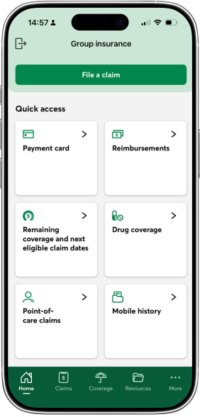
OMNI App Interface
01 /

Benefits administration is one of the most universally dreaded employee experiences.

Omni's users were forced to move between five separate systems: a retirement app, an insurance app, PDF benefit cards, a claims portal, and email threads. Each transition meant re-authentication, context-switching, and confusion.

The result was a wave of avoidable support tickets, eroded trust, and employees simply giving up on benefits they had already earned.

"

The goal was not to add features. It was to reduce the cognitive load of accessing benefits people already had.

02 /
search

Research

  • App store review analysis
  • User interviews
  • Support log synthesis
  • Information architecture
touch_app

Interaction

  • Claims workflow redesign
  • Apple Wallet integration
  • Telemedicine flows
  • Direct deposit setup
palette

Design System

  • Unified component library
  • Accessible color system
  • Biometric auth patterns
  • React-based UI framework
code

Implementation

  • Front-end components in React
  • Accessibility WCAG AA
  • Voiceover support
  • Dev handoff specs
03 /

Three distinct groups used Omni, each with different needs from the same platform.

badge

Employees with benefits

Needed fast access to coverage info, claims status, and their digital payment card without navigating multiple apps.

elderly

Retirees

Needed clear, simple tools for managing retirement savings and understanding their plan details without jargon.

local_hospital

Healthcare providers

Needed quick verification of patient coverage at the point of care.

info

One platform had to serve all three without compromising any of them.

04 /

The issues were not isolated. Each problem amplified the others.

Critical

Fragmented across five systems

Insurance, retirement, claims, deposits, and support all lived in separate apps. No single place to get a complete picture.

Critical

Paper-heavy claims process

Users downloaded PDFs, filled them manually, then emailed or faxed them in. No status visibility. No error prevention.

High Impact

Coverage information buried

Basic plan details required leaving the app entirely. This drove the majority of avoidable support contacts.

High Impact

No Apple Wallet integration

Competing insurance apps like Beneva already offered this. Users were asking for it directly in app store reviews.

High Impact

Direct deposit info not saving

Users repeatedly had to re-enter deposit and professional information. A basic trust-breaking bug with outsized impact on satisfaction.

05 /

I synthesized findings across three sources: app store reviews, user interviews, and support ticket logs. With no dedicated research team, I used AI to cluster patterns across hundreds of data points, which freed up time I could spend talking directly to users rather than doing manual tagging.

smart_toy
AI-assisted research

Support logs and app store reviews were processed using an LLM to surface recurring themes. All findings were reviewed and validated by me before informing any design decisions. The tool handled the volume. I made the judgment calls.

Real feedback that shaped the design

star App Store Review

"You should make an update which allows us to upload the insurance card to Apple Wallet. Other insurance companies such as Beneva already offer this feature."

android Google Play Review

"App doesn't save direct deposit info, or professionals I've added."

android Google Play Review

"It would be really nice to see exactly what my total coverage amounts are like on the website."

These were not edge cases. They represented the three most recurring complaint categories across all feedback sources.

0 %

of users struggled to find basic coverage information

Users could not locate basic plan details without leaving the app. Top driver of support volume.

0 %

would recommend the platform if basic info were easier to find

The bar for delight was surprisingly low. Surfacing cards, coverage, and claims in one place was all it took.

0 %

increase in trust when workflows were simplified

Clarity and trust turned out to be the same problem.

06 /

Rather than a feature-by-feature rebuild, I reframed the problem around the full benefits lifecycle: from understanding coverage to getting reimbursed. Each decision was evaluated against that lens.

01

Consolidated information architecture

I merged the retirement and insurance mental models into a single navigation hierarchy. The challenge was reconciling two product teams' taxonomies without making either user group feel lost. I ran card-sorting sessions to validate the final structure before building.

02

Claims workflow redesign: Upload, Classify, Review, Submit

I replaced the PDF-based process with a guided in-app flow. I chose a stepped model over a single long form because research showed users were abandoning mid-way due to overwhelm. Inline validation was added to catch errors before submission.

swap_horiz

Tradeoff: The stepped flow added one extra screen for power users who knew exactly what to do. I flagged this to the product team and we added a fast-track option in a follow-up sprint.

03

Digital benefit cards with Apple Wallet integration

Lost or inaccessible benefit cards were the single highest-volume support ticket category. I designed a digital card system with tap-to-show coverage details, and integrated Apple Wallet so users could access their card at a medical visit without opening the app. This directly addressed the most requested feature in app store reviews.

04

Fixed direct deposit persistence

Users were losing saved deposit information and professional details between sessions. I worked with engineering to identify the root cause and redesigned the settings flow to make save states explicit and confirmed, rebuilding trust in a part of the app that handled sensitive financial data.

05

React-based UI framework and unified design system

With four previously separate experiences, there was no shared component language. I built a modular React component system with accessible color contrast ratios, consistent spacing, larger touch targets, and voiceover labels. This also gave the engineering team a reusable foundation for future features.

07 /

The home screen surfaces everything an employee needs in one place: payment card, reimbursements, coverage details, claims history, and drug coverage, all without leaving the app. The bottom navigation consolidates what were previously five separate entry points into a single coherent system.

08 /

These figures come from a 3-month pilot and internal support log comparisons. Some are approximate as final data was still being compiled at handoff.

0 %

fewer support tickets

for lost or inaccessible benefit cards, vs. 3-month prior baseline

25-35 %

reduction in claim resubmissions

due to inline validation, measured during pilot

speed

Faster reimbursements

after self-serve direct deposit rollout, exact % pending final data

trending_up

Higher trust scores

among older user segments, measured across usability testing rounds

check_circle

Apple Wallet integration shipped

directly resolving the top-requested feature in app store reviews

09 /

The most important insight from Omni was that enterprise UX failures are almost never caused by missing features. They are caused by poor sense-making: interfaces that force users to hold too much context in their heads at once.

The dual role advantage

What made this project unusual was the combination of roles I held. Designing the system and then building it in React gave me a much sharper instinct for what is actually feasible under time and technical constraints. Design decisions that look clean in Figma do not always survive contact with a real codebase. Doing both forced me to make better tradeoffs earlier in the process.

Small decisions, outsized impact

What surprised me was how much outsized impact came from small decisions. Using plain language instead of benefits jargon, surfacing claim status proactively, showing a progress indicator in the claims flow, fixing a save-state bug that was silently destroying user trust. None of these were glamorous. All of them mattered more than any new feature we could have added.

When users can focus on the task and not on navigating the interface, that is when the design is working.

Like what you see?

Let's build something together.