Designing a conversational AI experience that helps everyday people understand their spending, identify behavioral patterns, and make financial decisions without the stress.
Most people know they should track their spending. Almost nobody does it consistently past the first two weeks.
The tools exist. The apps are free. The problem is not access.
The problem is that every budgeting app on the market was built around the assumption that users would behave like spreadsheets: consistent, disciplined, category-aware. Real people do not work that way.
FinSense was designed around a different assumption: that the right financial tool should adapt to how people actually behave, not punish them for failing to behave differently.
Before designing anything, I audited the tools people were already using and abandoning. The pattern was consistent across all of them.
Apps like Mint and YNAB organize spending into categories and show you totals. The assumption is that seeing the number will change the behavior. It does not.
Knowing you spent $340 on food delivery last month does not tell you which orders were worth it, which were stress purchases, or what a realistic target actually looks like for your life.
Most apps ask users to set a budget before they understand their own patterns.
Users set unrealistic targets, fail them in week one, feel shame, and quit. The tool created the failure it was supposed to prevent.
Charts and trend lines are powerful for people who already understand their finances. For the users who need help most, they add cognitive load rather than reducing it.
You still have to do the work of figuring out what the data means and what to do about it.
Every existing tool surfaces a number and leaves the user to feel bad about it.
None of them contextualize the behavior, explain why it happened, or offer a realistic path forward. FinSense was built to do exactly that.
I conducted user interviews focused specifically on budgeting anxiety, not budgeting behavior. The distinction mattered.
I wanted to understand why people stopped using financial tools, not just how they used them.
I used AI to help synthesize interview notes and identify behavioral patterns across responses, which let me move from raw qualitative data to structured insights faster without losing the nuance in individual responses.
Interview transcripts were processed using an LLM to cluster emotional themes and friction points by workflow stage. All findings were reviewed and validated by me before informing any design decisions.
Most users did not want a perfect budget. They wanted to understand their own patterns well enough to make one realistic change at a time. The goal was self-knowledge, not optimization.
The real culprits were invisible: unused subscriptions running in the background, impulse purchases during stressful weeks, delivery spikes that crept up gradually. Users could not see these patterns in a category chart.
Long-term financial plans overwhelmed users immediately. But a single specific suggestion consistently led to action. Small and concrete beat comprehensive and abstract every time.
I know I spend too much. I just don't know where to start and every app I've tried just makes me feel guilty without actually helping me do anything differently.
User interview participantThe core strategic shift was reframing what a financial app is for. Not a tracking tool. Not a reporting tool. A guidance system.
Show the user their data and let them figure out what it means
Analyze the behavior, explain the pattern in plain language, and suggest one realistic next step
The AI narrates spending trends in plain language, the way a financially literate friend would explain them.
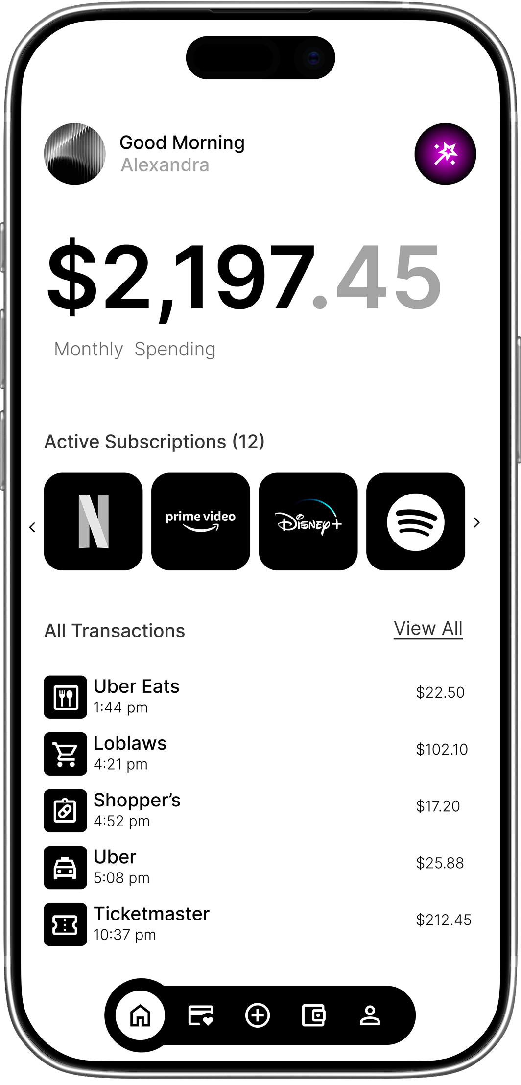
FinSense surfaces invisible leaks: recurring subscriptions the user forgot about, impulse spending clusters, delivery spikes tied to specific times of week.
These are the patterns that actually drain budgets and they are invisible in a standard category chart.
Every insight follows the same structure: here is what I noticed, here is why it matters, here is one thing you could do.
The explanation comes first. The suggestion comes second. This was the single design decision that had the biggest impact on user trust.
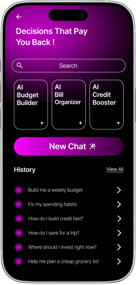
Instead of navigating tabs and dashboards, users ask questions in natural language.
The AI answers in context, with access to the user's actual transaction data.
A pure chat interface loses the at-a-glance awareness that makes financial tools useful day to day. A pure dashboard interface buries the guidance users actually need.
FinSense uses both: the dashboard gives users a current state view, the chat is where they go when they want to understand something or make a decision.
Tradeoff: Two surfaces create a navigation challenge. I resolved this by making the chat persistently accessible from the dashboard rather than treating them as separate sections. The dashboard surfaces anomalies. The chat explains them.
Rather than showing "dining: $340," FinSense shows "delivery orders up 60% this month, mostly weekday evenings."
The same data, reframed around the behavior rather than the category.
This required a different data model and close collaboration with the engineering team to define what patterns the AI would be trained to detect.
Budgets in FinSense are generated from the user's real transaction history, not from generic templates.
The AI proposes a budget that reflects what the user actually spends, then identifies one or two areas where a realistic reduction is possible. Users do not start from zero. They start from their own baseline.
Designing what the AI says was as important as designing the screens it lives in.
I built a conversation pattern library that covered: how the AI introduces an insight, how it handles a user who pushes back, how it responds when it does not have enough data, and how it maintains a tone that is supportive without being condescending.
The AI was designed to feel like a financially literate friend, not a bank chatbot.
These results come from usability testing sessions conducted with participants across different financial situations and comfort levels with money management tools.
Self-reported after using FinSense for two weeks compared to their previous tool
Users understood where their money went without needing to interpret charts
Minutes instead of hours, because the AI surfaced the relevant context directly
Users attributed this to recommendations feeling personalized and achievable rather than generic
Users trusted the AI significantly more when it explained the pattern before offering a suggestion. This validated the explanation-first design principle and shaped the entire conversation flow architecture.
The behavior detection that surfaced invisible spending patterns users had not noticed themselves. This was consistently described as the moment the app felt genuinely useful rather than just another tracking tool.
Users do not resist AI because they do not understand how it works. They resist it because they do not trust that it understands them.
The explanation-first pattern was the most significant design decision of the project and it came directly from that insight. When the AI explained what it noticed before telling a user what to do, trust scores went up measurably in every testing round.
The AI was not more capable in those flows. It was more legible. Legibility and capability are not the same thing and in AI product design, legibility matters more.
It required thinking about edge cases the way an engineer thinks about them:
Every one of those cases needed a designed response, not a default one.
FinSense reinforced something I now bring into every AI project: the best AI interfaces reduce the feeling of being analyzed and increase the feeling of being understood.
Those are opposite emotional experiences and the design is what creates the difference between them.
The culmination of research, iteration, and user-centered design—bringing FinSense to life.
Let's build something together.