Case Study 2022 - 2023

EVIDENT CONNECT: Industrial Inspection Data Platform

Redesigning a legacy data transfer tool for NDT engineers working in high-pressure, safety-critical environments.

Role Lead UI/UX Designer
Timeline 3 months
Platform Mobile-first redesign (iOS)
Domain Industrial NDT, Field Engineering
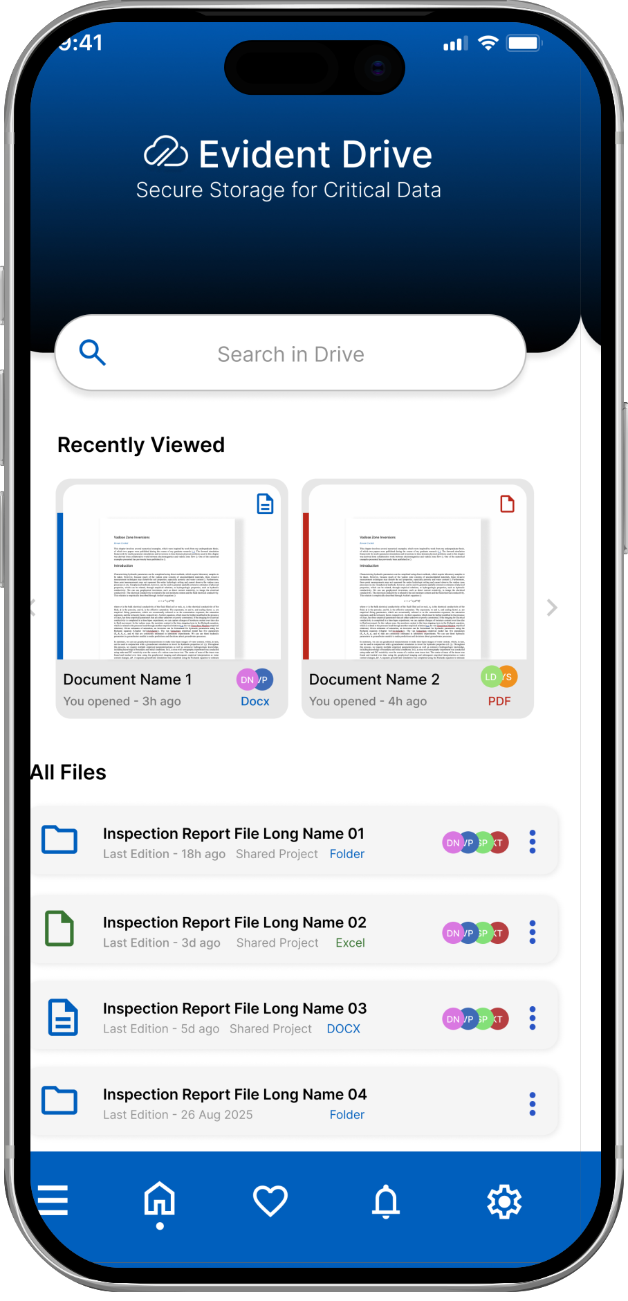
Evident Connect Final Design
01 /

Evident Connect is the companion app for non-destructive testing equipment.

NDT engineers use it to upload, export, and transfer inspection data from machines like Flaw Detectors, Ultrasonic Detectors, Eddy Current Array Detectors, and various Olympus NDT inspection scanners.

Where it's used: high-stakes environments

oil_barrel

Oil & Gas

Pipeline integrity checks and oil spill prevention inspections

flight

Aerospace

Aircraft safety assessments and structural integrity testing

wind_power

Wind Energy

Turbine blade inspections and tower structural analysis

factory

Manufacturing

Quality control and weld inspection processes

warning

These are not low-stakes environments.

Before Evident Connect existed, the industry standard was transferring critical inspection data via USB keys, a method that could delay results by days and posed serious data security risks.

"

The app existed to modernize this. But the interface itself had become a barrier to the very efficiency it was meant to create.

02 /
  • groups Field studies with NDT engineers
  • record_voice_over User interviews
  • science Usability testing
  • analytics Pain point synthesis
  • menu Navigation restructure
  • person Role-based workspace model
  • folder_open Document hierarchy redesign
  • ads_click Touch target system
  • folder_copy File browsing and sorting
  • dashboard_customize Workspace personalization
  • view_list List view redesign
  • brush Visual language refresh
  • interests Icon system
  • smartphone Mobile-first component set
  • route Simplified navigation
03 /

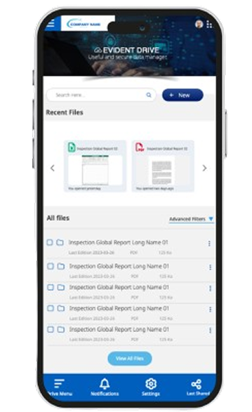
The issues were not isolated bugs. They reinforced each other. A cluttered workspace made navigation harder. Competing navigation menus made the cluttered workspace worse.

Engineers had to decide which menu to use before starting any task. The app had two hamburger menus simultaneously, creating immediate confusion about where anything lived.

Engineers use this app on-site, often under time pressure, sometimes in poor lighting or wearing gloves. Tiny tap targets caused repeated mis-taps and slowed down every single interaction.

All users in a company saw all files by default. Engineers had to manually filter through content that had nothing to do with their project or role before finding what they needed.

The design did not reflect real NDT workflows. Checkboxes cluttered list views. Folder icons appeared on non-folder items. Document details were surfaced at the wrong moments. The app demanded engineers adapt to it rather than the other way around.

Mismatched UI components, a visually dominant hero image that competed with the actual content, and an overall aesthetic that felt foreign to the device it was running on all added unnecessary cognitive load.

04 /

I conducted focused sessions with NDT engineers across multiple industries including oil and gas and aerospace. Rather than a controlled lab setting, I observed them using the existing app during real inspection workflows.

psychology
AI-Assisted Research

With a 3-month timeline and no dedicated research team, I used AI to help cluster and surface patterns across session notes and open-ended feedback. This freed up time I could spend in the field with engineers rather than at my desk doing manual synthesis.

Session notes and interview responses were processed using an LLM to identify recurring themes and flag outlier responses. All findings were reviewed and validated by me before informing any design decisions.

Three insights shaped every decision that followed

01

Engineers want less, not more

touch_app Tap to reveal

Every extra element on screen competes for attention they cannot spare during an active inspection. The work is already demanding. The interface should not add to that load.

02

Different roles need different views

touch_app Tap to reveal

A field technician and a project supervisor are looking at the same files but need completely different views. A one-size-fits-all workspace meant neither group felt the app was built for them.

03

Mobile constraints are non-negotiable

touch_app Tap to reveal

Touch had to be the primary design constraint. Interactions designed for a mouse and keyboard failed completely in field conditions. This was not a secondary consideration; it was the foundation.

05 /
01

Unified navigation: one menu instead of two

I consolidated the two competing hamburger menus into a single navigation system. The company logo and user profile were moved inside the single burger menu, clearing the main interface of competing chrome.

I considered a bottom tab bar but the existing user mental model was already built around the hamburger pattern, so consolidating rather than replacing reduced the learning curve.

balance
Tradeoff

Some power users had shortcuts they relied on that did not survive consolidation. I documented these for the product team to reintroduce as contextual actions in a later release.

02

Personalized workspaces instead of shared file views

Rather than showing every user every file, I introduced a role-based workspace model. Engineers saw their active projects by default.

This directly addressed the top complaint from interviews. A personalized space was also identified as the single most appreciated feature in post-testing feedback.

03

Rebuilt touch targets and simplified list views

I removed checkboxes from list views entirely, replacing them with a cleaner tap-to-select model. Document details were moved under an ellipsis to reduce clutter.

The folder icon was reserved exclusively for folders, eliminating a recurring source of user confusion. All primary actions were enlarged to meet minimum touch target sizes for mobile.

04

Quieter visual hierarchy

The previously dominant hero image was replaced with a more subtle one so the actual content could take focus. UI components were standardized to remove visual inconsistency.

Simple directional arrows replaced the complex filtering system for sorting, making the most common action in the app a single tap.

05

AI-assisted component exploration

During the UI phase, I used AI to rapidly generate and iterate on component variations, then reviewed and refined the shortlisted options myself.

Given the tight timeline, this let me explore a wider range of visual directions than I could have manually, without sacrificing quality in the final decisions.

06 /

These results come from usability testing sessions conducted with NDT engineers after the redesign.

0 /10

Average usability rating

Rated by engineers who used both versions

80%

found the earlier design less user-friendly

90%

preferred the new personalized workspace

70%

want more automation: top priority for next phase

trophy
Most Appreciated Feature

Personalized user space

Identified as the single most appreciated feature across all testing sessions

07 /

Physical context as a hard design constraint

Evident was the project that made me take physical context seriously. I had always understood that mobile design was different from desktop. But watching an engineer mis-tap a control repeatedly because they were under time pressure and the screen was hard to see in bright light made that abstract principle concrete and urgent.

The 70% who wanted more automation

The 8.7/10 usability rating mattered, but so did the 70% who wanted more automation. That number is not a failure. It is a signal that the redesign raised the floor enough that engineers now trusted the app and wanted it to do more for them. That is a different and better problem to have than the one we started with.

AI tooling as a multiplier

Working under a 3-month timeline pushed me to use AI tooling more deliberately than I had before. Using it for research synthesis and component exploration gave me back hours I could spend on decisions that required human judgment. Knowing when to delegate to a tool and when to think something through yourself is a skill I now treat as core to how I work.

Accepting what would not get done

The hardest part of the project was accepting what would not get done in three months. The decisions about what to prioritize and what to defer were as important as the design decisions themselves.

08 /

The transformation from legacy interface to field-ready design.

Before
Evident Connect Before Redesign
close Dual hamburger menus
close Tiny touch targets
close Cluttered shared workspace
arrow_forward
After
Evident Connect After Redesign
check Unified navigation
check Field-ready touch targets
check Personalized workspace

Key improvements at a glance

menu

Unified Navigation

Single hamburger menu replacing the confusing dual-menu system

person

Personalized Workspace

Role-based views showing only relevant projects and files

touch_app

Field-Ready Touch Targets

Enlarged tap zones designed for gloved hands and bright sunlight

visibility

Quieter Visual Hierarchy

Content-first design with standardized, consistent components

Like what you see?

Let's build something together.