Case Study April - August 2025

EVERFLOW: Partner Marketing Platform

Redesigning a powerful but overwhelming Google Ads integration for affiliate managers and media buyers who live inside it all day.

Role UX, UI, Interaction Design, Systems Design
Timeline 5 months
Platform Web application
Domain Affiliate marketing, Performance advertising
Everflow Final Design
01 /

Everflow is a partner marketing platform used by affiliate managers, traffic teams, and advertisers to manage large-scale campaign operations.

The Google Ads integration was one of its most powerful features and one of its most painful to use. Users managing hundreds of campaigns, ad groups, and ads were doing it inside an environment that was not designed to scale.

The friction was everywhere

table_rows
Tables were dense
filter_alt
Filters moved around
view_sidebar
Side panels behaved unpredictably
data_usage
More data meant more problems

The problem was not that the integration was missing features. It was that the existing features were buried under a layer of friction that slowed down every high-value workflow. Power users were working around the interface rather than through it.

"

The goal was not to add more capability. It was to make the capability that already existed actually usable at scale.

02 /
search

Research

  • groupsUser interviews with affiliate managers, traffic teams, and advertisers
  • visibilityWorkflow observation
  • psychologyPain point synthesis
  • smart_toyAI-assisted pattern clustering across feedback
widgets

Systems Design

  • table_chartUnified table system
  • filter_listFilter placement standardization
  • side_navigationSide panel redesign
  • ruleRule builder overhaul
touch_app

Interaction Design

  • account_treeCampaign, ad group, and ad hierarchy
  • boltQuick action patterns
  • unfold_lessCollapsible logic sections
palette

Visual Design

  • space_barSpacing and alignment system
  • format_line_spacingVisual hierarchy rules
  • interestsCustom icon set for scanning speed

Deliverables Shipped

descriptionResearch synthesis
routeWorkflow redesign
table_chartTable system
ruleRule builder
interestsCustom iconography
03 /

The issues were structural, not cosmetic. Each one compounded the others.

Three levels of the same hierarchy had inconsistent layouts, inconsistent actions, and inconsistent rules. Users had to relearn the interface at every level.

This single issue generated more support tickets than almost anything else. Users could not build a consistent mental model of where to look because the answer changed depending on which page they were on.

Power users managing large accounts had to do too much scanning to find what they needed. The information was there but the visual structure made it slow to parse.

The side panels that handled editing and reviewing data were not predictable. Users could not rely on muscle memory because the panels behaved differently depending on context.

Complex logic displayed as long blocks of text was difficult to read, edit, and verify. Users avoided the rule builder when they could, which meant they were not using one of the platform's most powerful features.

Switching between views during routine work cost real time. The interface did not support the pace that high-volume affiliate managers needed to work at.

04 /

I interviewed affiliate managers, traffic teams, and advertisers to understand how they worked inside the integration day to day. Rather than asking what they wanted, I focused on observing where they slowed down, where they made errors, and where they gave up and found a workaround.

psychology
AI-Assisted Research

With a complex multi-workflow product and a lean team, I used AI to help cluster patterns across interview notes and support ticket logs, which let me move faster from raw data to actionable insights without losing depth.

Interview transcripts and support feedback were processed using an LLM to surface recurring friction points and group them by workflow stage. All findings were reviewed and validated by me. The synthesis took hours instead of days, which gave me more time to spend on the design decisions that mattered.

What users consistently needed

account_treeClear hierarchy
patternPredictable patterns
speedFaster scanning
touch_appFewer clicks
lightbulbSimpler mental model
05 /

I explored three distinct approaches before arriving at the final direction. Each taught me something that shaped the final system.

A

Condensed Tables

Goal:Improve scanning speed for expert users
check_circle
What worked:

Fast and efficient for high-volume accounts. Power users loved it.

cancel
What did not work:

Too dense for onboarding or less experienced users. It optimized for one user type at the expense of another.

arrow_forwardTook: Scanning efficiency
B

Modular Panels

Goal:Break information into predictable, digestible blocks
check_circle
What worked:

Better grouping and much clearer hierarchy. Information felt organized.

cancel
What did not work:

Too many modules increased scrolling to a point that slowed workflows back down again.

arrow_forwardTook: Hierarchy clarity
C

Simplified Rule Builder

Goal:Make complex logic easier to read, edit, and verify
check_circle
What worked:

Collapsible logic sections made the structure immediately clearer. Users could scan rules at a glance for the first time.

cancel
What did not work:

Required new component patterns that engineering would need time to adopt. Had to balance design ambition with build feasibility.

arrow_forwardTook: Rule builder approach
merge

The final system took the scanning efficiency from A, the hierarchy clarity from B, and the rule builder approach from C, then resolved the tradeoffs that made each individual exploration fall short.

06 /

Rather than redesigning screens in isolation, I built a unified system that could scale across the entire platform, not just the Google Ads integration.

table_chart

Unified Table System

One consistent table component used across Offers, Partners, Traffic, and Google Ads. Same column logic, same sort behavior, same action placement. Users no longer had to relearn the interface when switching between sections.

filter_list

Standardized Filter Placement

Filters moved to a consistent location across every page. This single change directly addressed the top support ticket category and eliminated one of the most common points of user confusion.

side_navigation

Redesigned Side Panels

Panels were rebuilt with a predictable structure. Quick actions lived in the same place regardless of context. Users could develop muscle memory for the first time.

account_tree

Clearer Campaign Hierarchy

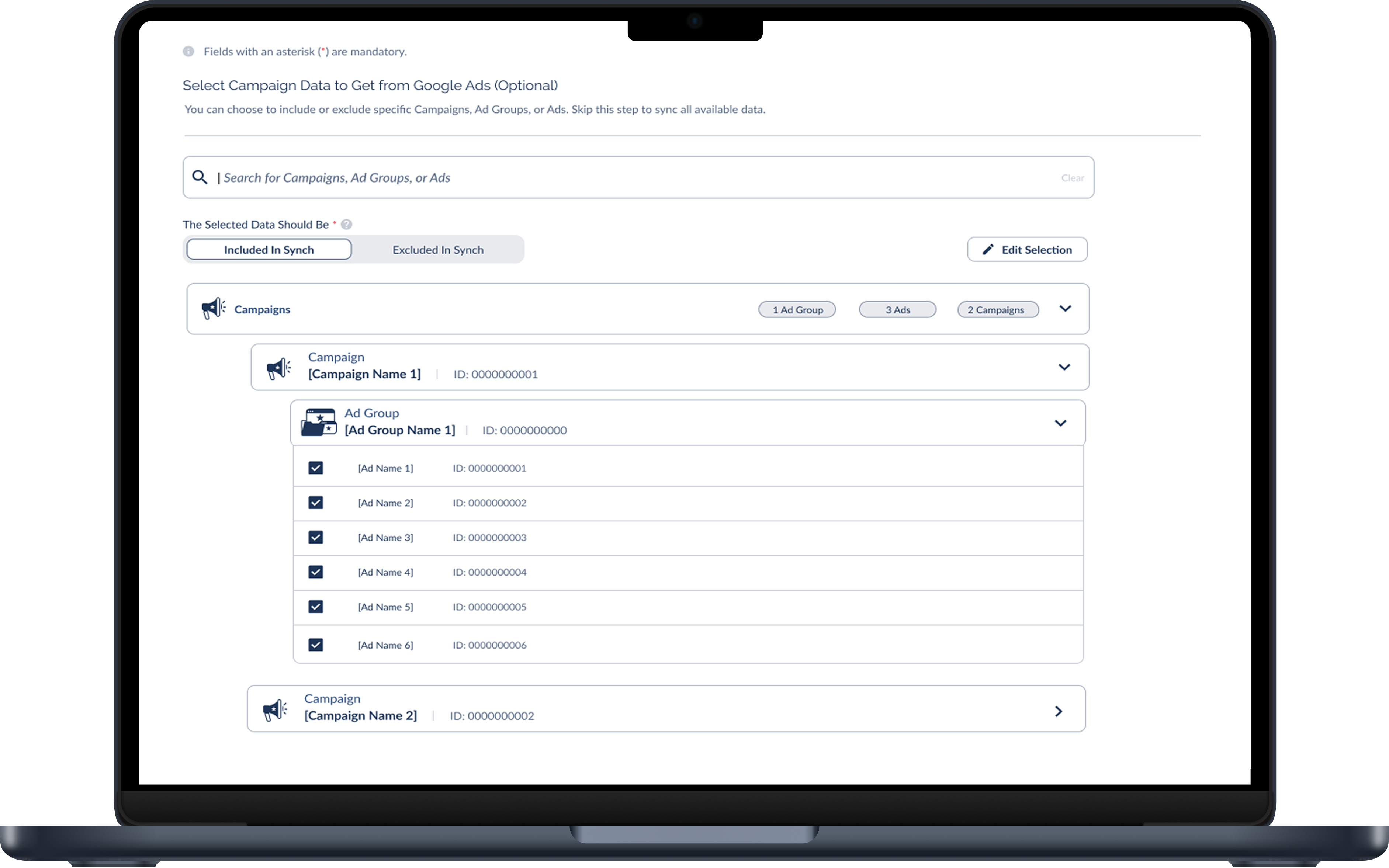
Campaigns, ad groups, and ads each got distinct but related visual treatments that communicated their relationship without requiring users to read labels to understand the structure.

rule

Rebuilt Rule Builder with Collapsible Logic Sections

Complex rules became scannable. Users could see the full structure of a rule at a glance and expand only the sections they needed to edit. Adoption of the rule builder increased after launch.

interests

Custom Icon Set

I designed a custom set of icons specifically for this context, covering ad groups, ads, and campaigns. Generic icons were creating ambiguity at the scanning level where users needed to move fastest.

Ad Group Icon Ad Icon Campaign Icon
space_bar

New Spacing and Alignment System

Consistent spacing rules across every component reduced visual noise and made dense data feel manageable rather than overwhelming.

07 /

These results come from internal tracking, support team feedback, and qualitative interviews conducted after launch.

speed

Faster Navigation

Reported by power users managing large accounts, the primary pain point going into the project

trending_down

Clear Reduction in Support Tickets

Related to rules, caps, and filter placement after the standardized system shipped

trending_up

Increased Adoption

Of the Google Ads integration after launch, measured by the client success team

verified

Higher Confidence

Reported by users when using the integration, particularly among teams onboarding new advertisers

extension

System Patterns Adopted

By engineering for future feature expansions, meaning the work scaled beyond the Google Ads integration itself

format_quote
Qualitative feedback from users after launch

The redesign was described as more organized, easier to teach to new team members, and easier to navigate at scale.

08 /

Designing screens vs. designing systems

The most important thing this project reinforced was the difference between designing screens and designing systems. Individual screens can look clean and still create a broken experience if they do not follow consistent rules. The friction users were feeling in Everflow was not coming from any single bad screen. It was coming from the accumulated cost of small inconsistencies across every workflow.

Features that require cognitive effort do not get used

The rule builder taught me something specific about enterprise UX. Features that require cognitive effort do not get used, even when they are powerful. The old rule builder was technically capable of handling complex logic. Users avoided it anyway because reading it was too hard. The redesign did not add any new capability. It just made the existing capability legible. Adoption went up immediately.

Working with engineering as a design partner

I also came away with a clearer sense of how to work with engineering as a design partner rather than a handoff recipient. The component patterns I built were adopted for future features beyond the Google Ads integration. That only happened because I involved engineers early in the exploration phase and understood the cost of what I was asking them to build. Design systems that engineers can actually use are more valuable than beautiful systems that sit in Figma.

09 /

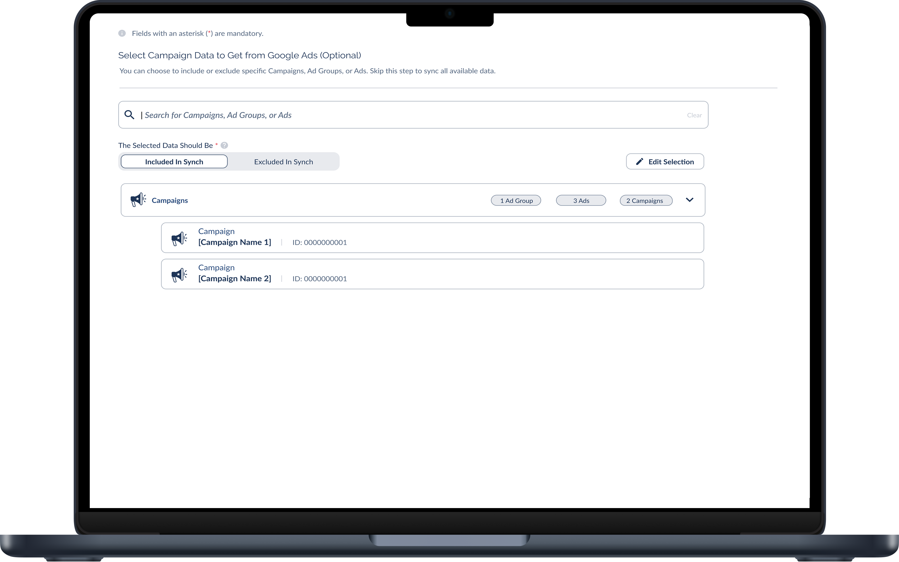
The transformation from overwhelming complexity to structured clarity.

Collapsed View
Everflow Final Design - Collapsed View
Expanded View
Everflow Final Design - Expanded View

Like what you see?

Let's build something together.